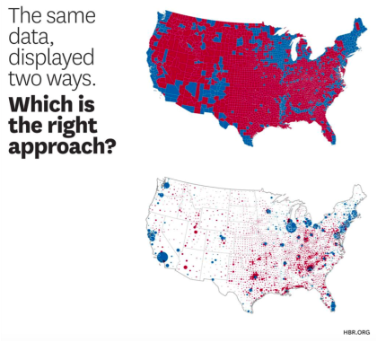
It’s (never-ending) election season again (or maybe forever?), and so we want to draw your attention to the way media outlets use maps and charts to obfuscate what’s actually happening.
In this witty visual piece on the Harvard Business Review, we see a couple of examples of fudging the point with charts, including a map from the 2008 presidential race, showing a whole lot of red districts, making it look like a McCain victory was a sure thing.
In this witty visual piece on the Harvard Business Review, we see a couple of examples of fudging the point with charts, including a map from the 2008 presidential race, showing a whole lot of red districts, making it look like a McCain victory was a sure thing.
In case you’re really into campaign mania (campaign-ia?), Mark Monmonier’s 1991 How to Lie with Maps is another useful book you might want in your library. He argues (and we agree) that if you want to make a good map, lying is essential. Not because cartographers are full of crap, but because there’s no way to make a complete picture of all the data -- and even that data is incomplete.
“To avoid hiding critical information in a fog of detail, the map must offer a selective, incomplete view of reality. There's no escape from the cartographic paradox: to present a useful and truthful picture, an accurate map must tell white lies.”
Both the article and Monmonier's book take their titles from How to Lie with Statistics, a book written in 1954 by journalist Darrell Huff. It’s intended as an introduction to statistics through the frame of a critical evaluation, and is filled with funny drawings. It’s also one of the best-selling books ever written on statistics and the fact that its title structure is still inspiring writers and editors shows the enduring legacy of our healthy skepticism when we’re presented with a data story.
Let’s do our part to use data responsibly.
