
Here are some of our responsive, print-ready charts and graphics.
Got a request for something you don't see here? Email info@getbulb.com and let us know!
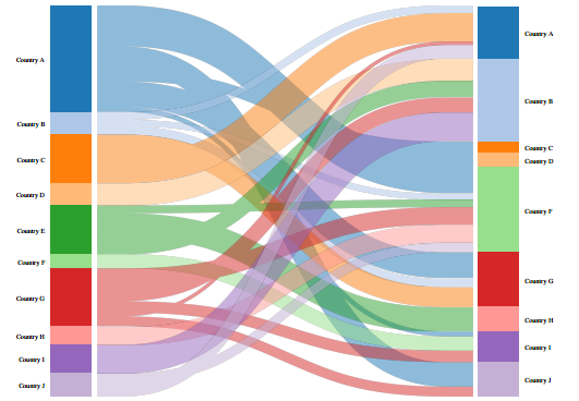
Category flow diagrams show movement between people, places, or things.
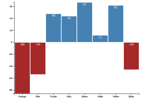
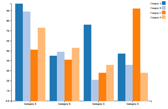
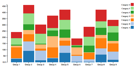
Bar charts are one of the most underrated types of visualizations. They're easy to use, and more often than not, a lot clearer for your audience than something fancy.
|
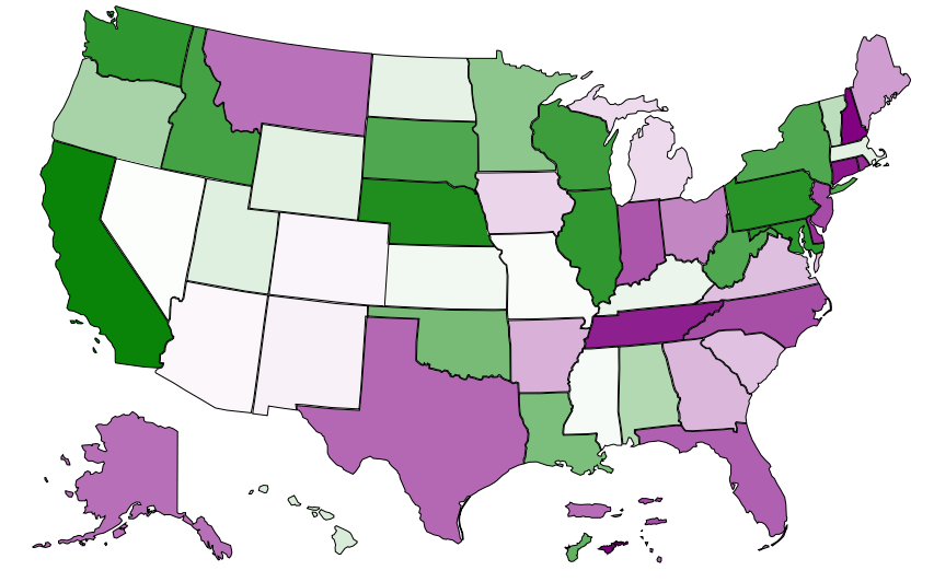
Use a map when the data you're visualizing needs to be viewed geographically. GetBulb's map colors use a palette that's viewable by people with color blindness.
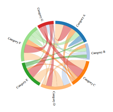
Try a chord diagram when you want to represent movement or change between different groups of entities. It's one of the more difficult types of data visualizations to use, but you can pack a whole lot into a single chart.
|
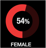
Quick facts elements are great for drawing attention to important details or variables that need to be seen in relation to your other content.
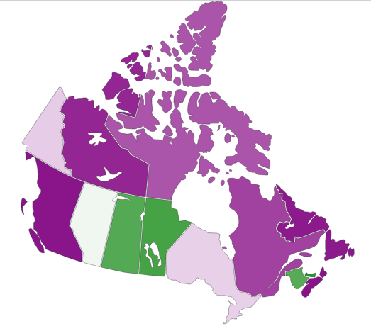
This map of Canada is divided by provinces. Use it, for example, to show the provinces that have gender parity in politics. (Go Canada!)
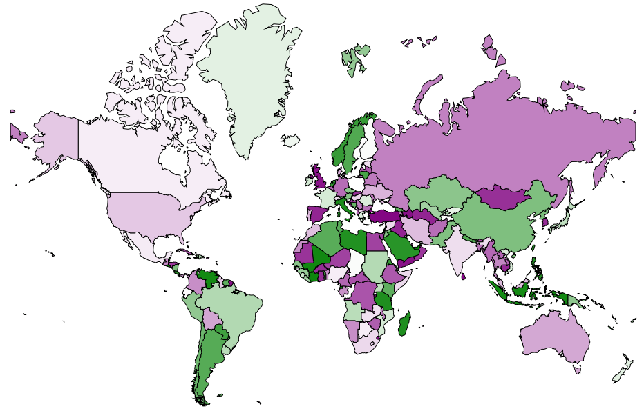
The world map in our library uses the Mercator projection. If enough people send us puppy gifs, we'll add one in the Arno-Peters projection, too.
|
There's more! We have line graphs, pie charts (yes, they do have a place), text elements, and even more. To see the full library of elements, create a free GetBulb account.