• Home
  • Product
    • Element library
    • Data formatting guide
  • Blog
  • Sign in
  • Create account
  • Home
  • Product
    • Element library
    • Data formatting guide
  • Blog
  • Sign in
  • Create account

We're here to make data visualization as easy as pie (charts).

Step 1: Pick a chart type

Choose an element from the GetBulb library and drag it into the edit window. You can add more panels horizontally and vertically, to create a complex graphic without having to use a separate image editing tool.

Picture
See element library

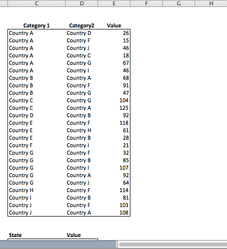
Step 2: Format your data

Select your data in Excel or any CSV format. You'll copy and paste it into the graphic, so highlight it and make sure you've got everything formatted and selected. If you make a mistake, just drop another data set in -- it will overwrite what's already there. Check out our support center if you need help formatting. 
Picture
See formatting guide

Step 3: Create your graphic

Paste your data into the element to create your graphic. Export or save it to edit later. You can export as a PDF or PNG file, or you can send an SVG to another program if you want to add details or branding elements, change colors, or put it into a different layout.
Picture
Try your own data

About GetBulb

About 
Contact
Press and Media 

Support

Resources
FAQ
Documentation
© COPYRIGHT GETBULB 2015. ALL RIGHTS RESERVED.