GetBulb

  • Home
  • Product
    • Element library
    • Data formatting guide
  • Blog
  • Sign in
  • Create account
  • Home
  • Product
    • Element library
    • Data formatting guide
  • Blog
  • Sign in
  • Create account

Data Journalism Weekend with GetBulb and The Irish Times

11/30/2015

0 Comments


We’re a sponsor of this weekend’s Data Journalism Challenge, with The Irish Times, the Hacks and Hackers Data Journalism Meetup, and Qualtrics. It’s a two-day event where teams will compete to create a story from a brand-new dataset about attitudes to work across ten European countries.

Teams should include between 5 and 7 members, and you can form your own, or you can just show up and be placed on a team based on your skills. Winners will receive a Qualtrics licence to research into consumer behavior. 

Thinking about entering? You’ll be judged based on how well you visualize, narrate, socialize, humanize, personalize, and utilize communication. In other words, can you make the data compelling without skewing the results too much, and can we still see the human beings behind the data? If you’re building a team, prepping to join us, or just curious, here’s a list of tips that we think will boost your chances of creating a prizeworthy data visualization.

1. Build a smart team by thinking about the people, not the tools they can use
Data journalism requires solid reporting, analysis, storytelling and visual representations, which means that what you need is almost never in a single person’s skillset. The most important factor is to think about the capacity of each member; the technical skillset is just one type of contribution.

You can teach someone to use a camera in a few minutes, but learning what to point it at takes years. Yes, it’s helpful if you have someone who can find their way around Javascript, and someone who is a whiz in InDesign is definitely an asset, but judges will be looking for that ‘something extra’, which you’re most likely to find if you include someone who is a creative (and pragmatic) storyteller on your team. Besides, if you mix your skills, you’ll have a lot more fun and come up with a much wider range of ideas.

2. Know what you’re trying to say, then get out of the way
Analyze the data first, then come up with your story, and then design what you need to convey it.
You’re unlikely to have the kind of data and time to get something like this finished, but one of the best uses of data is in Spotify’s Serendipity feature, which shows you where two people listening to Spotify pressed play on the same song at the same time. It works because the designer, Kyle McDonald, made a decision before he built the tool. He knew that he wanted it to work with realtime data, where he wanted to draw the data from, and what shape it took. Then he did it and got out of the way, letting serendipity do its own thing.

3. Choose the simplest possible elements
All of the ‘keep it simple’ advice from every other realm applies tenfold in data journalism. It’s not just about getting rid of chartjunk, but making sure that you put understanding before anything else. Understanding is not some simple formula you can follow but is a combination of clarity and aesthetics -- it needs to show information clearly, but it needs to be compelling enough to grab attention, and that’s not something you can just science-up. 

Have a read of this part of the Data Journalism Handbook (and really, the whole handbook, if you have time), which reiterates Strunk and White’s advice about avoiding unnecessary words and using the simplest ones possible. You probably already know that design is done when there's nothing left to take away. Also remember that vanilla is a flavor (and when it's done right, it's the best one).

4. First drafts are always terrible, and it's okay to fail
Don’t panic, just find the best data you can, clean it up, and start again. If it turns out that your data isn’t actually that good, then there isn’t much you can do to salvage it -- good visualizations need a foundation of good data. Even with the best data, be prepared to fail a few times before you get something that works. If you're struggling, it can be hard to know if it’s the data, or if you’re having an off-day. Don’t expect your first draft to be the final product, just make sure you leave yourself enough time to do a few versions before you have something you're happy with.

5. Have fun
A good story is interactive by nature, which means there’s no need to overegg your visualization with flourishes that show off your talent but give nothing to the reader. But just because data visualization is serious business doesn't mean you shouldn't enjoy it. Like with writing and any other creative act, if you’ve had a good time, that will come through. For example, this taxonomy of London hipster coffee shop names is genuinely interesting, but it also looks like the people behind it had a pretty entertaining time making it. It looks good, and it's easy to follow, even though it's packed with information.

6. Don't be a jerk
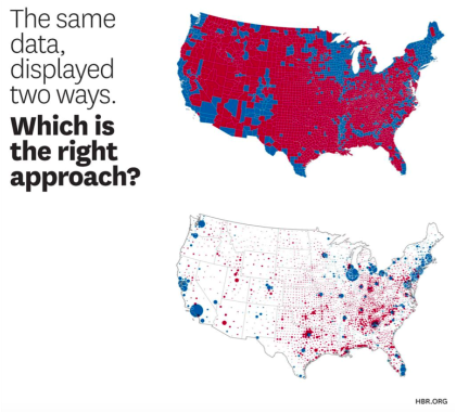
 Telling a good story with data visualization means taking some kind of position without detracting from what the data is actually saying, and there aren’t any reasonable shortcuts to doing this. It’s both an art and a science, unless, of course, you’re Fox News, who are one of the main culprits in being jerks with data. There are arguments for not starting your Y-axis at zero, but not many good ones.

7 Make sure it works technically
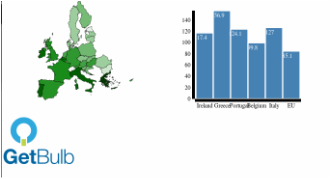
Now that non-responsive content tools are practically unheard of, it can be easy to overlook the way things work across different browsers and platforms. If you're using GetBulb to make your graphics, they're responsive by default, but depending on how and where you embed them, you'll still need to test. For most people, testing in a few different browsers and devices is plenty, so long as your story is aimed at people who generally keep their tech tools up to date.

If your intended audience is in the public sector, or in one of the more 'old school' industries like finance, law, or medicine, remember that these people don't always choose their platforms and operating systems, but have things like Windows XP and older versions of Internet Explorer forced on them by sadistic IT departments. This means that if you want to reach them, you'll need to make sure your graphics work in the tools they'll be using when it's the right time to reach them.

Creating good data visualization isn't just about showing what you can do, it's showing that you can meet your audience's needs, even if they're using IE8. 

Want to register a team, or just sign up as an attendee? Go here -- it's free! 


0 Comments

Law, Sausages and Data Visualization

11/25/2015

0 Comments

 
Whether it was Otto Von Bismarck, John Godfrey Saxe, or Mark Twain who said it first, you really don’t want to see how these things are made. ​
“Laws, like sausages, cease to inspire respect in proportion as we know how they are made.” ​
Same goes for data visualizations, or just about any processing of large sets of data from sometimes messy, unreliable sources.

While everyone likes the final product, most people who don’t work directly with data have no clue how much effort goes into turning a set of dirty data into a beautiful and reliable visualization. Beautiful is pretty easy, actually, compared to what it takes to scrub and prepare data. Once a dataset is made into a graphic, the data tends to be given more weight, which is why it’s so crucial to make sure you’re working with data you can trust.

We’ve been speaking to some of our active users, and you’ve all mentioned data quality and the time it takes to scrub the stuff as key problems in your workflows. One of you even called yourselves “overpaid information janitors” (although we wouldn’t agree you’re overpaid -- this isn’t an easy job), and it’s entirely true. In fact, data science professionals spend between 50 and 80 per cent of their time cleaning and checking data.

If you’re working with data, you already know that much of the value comes from the people who clean the data so that it can be useful to the algorithms whose builders get all the credit. Of course, we automate as much as possible, there’s always manual work to be done, which anyone outside the task may not understand. The business value comes from the people, not the numbers.

So we thought we’d make a little checklist you can use with people who’ve asked you to just whip something up. We can help you with the last-mile problem of visualizing what you’ve cleaned, but we know that’s only one of the hard parts of working with data.

Should you make a data visualization?


  • Is the data from a trusted source?
  • ​Can the datasets you’re using be aligned with the ones you already have?
  • Are the errors relatively consistent (meaning your cleaning tasks will at least be a little more predictable)?
  • Do you have access to the original raw data?
  • Once you’ve scrubbed a sample of the data, is there enough reliable there to make an interesting visualization?
  • Has the data been collected with a purpose that is compatible with the reason you’re using it?
  • Are you allowed to use this data?
  • Is there a compelling reason to visualize this data? (e.g., is it for an external audience you need to impress?

If you answered no to too many of these, then consider making some quick visualizations in Excel (or GetBulb), to help you learn the shape of the data and what’s in it. Then you’ll either be ready to make a visualization, or you’ll realize you don’t need one.
0 Comments

How to lie with charts

11/8/2015

0 Comments

 
It’s (never-ending) election season again (or maybe forever?), and so we want to draw your attention to the way media outlets use maps and charts to obfuscate what’s actually happening.

​
In this witty visual piece on the Harvard Business Review, we see a couple of examples of fudging the point with charts, including a map from the 2008 presidential race, showing a whole lot of red districts, making it look like a McCain victory was a sure thing.
Picture
In case you’re really into campaign mania (campaign-ia?), Mark Monmonier’s 1991 How to Lie with Maps is another useful book you might want in your library. He argues (and we agree) that if you want to make a good map, lying is essential. Not because cartographers are full of crap, but because there’s no way to make a complete picture of all the data -- and even that data is incomplete.

“To avoid hiding critical information in a fog of detail, the map must offer a selective, incomplete view of reality. There's no escape from the cartographic paradox: to present a useful and truthful picture, an accurate map must tell white lies.”

Both the article and Monmonier's book take their titles from How to Lie with Statistics, a book written in 1954 by journalist Darrell Huff. It’s intended as an introduction to statistics through the frame of a critical evaluation, and is filled with funny drawings. It’s also one of the best-selling books ever written on statistics and the fact that its title structure is still inspiring writers and editors shows the enduring legacy of our healthy skepticism when we’re presented with a data story.

Let’s do our part to use data responsibly.
0 Comments

Data visualization guidelines from The Sunlight Foundation

4/12/2015

 
What element should you use? Don’t take our word for it! The Sunlight Foundation has a guide to their data visualization process that provides a pretty good, structured starting point and a handy quality benchmark (if you agree with us that the Sunlight Foundation is pretty great at what they do).

Our favorite tips:
Use pie charts sparingly, and only if you want to compare 2-3 things. It’s hard to judge the size of circle segments. lf you have a series of things you want to compare, a bar chart probably works better
Line graphs are what you need when you have one variable you want to show over time, or when you want to compare more than one variable over time.
While it’s tempting to use maps as often as possible, they’re only the right choice if the primary component of your story is geographical. If you’re only interested in one variable, a bar chart might actually be easier to read.

What’s also useful about the guide is that they include design tips about title size and placement, gridlines, and spacing, as well as color hierarchies. These are things you’ll already know if you’re a designer, but if you’re just a data geek trying to tell a good story, it’s helpful in all kinds of ways.
​

You can download the guide here http://sunlightfoundation.com/blog/2014/03/12/datavizguide/

Making a map-based graphic with GetBulb

11/10/2014

0 Comments

 
Picture


​We’re noticing that many of you are curious about the map elements in the GetBulb library, but haven’t tried them yet. They’re actually one of the simpler elements to use, since all you really need are two columns of data: country names, and whatever value you want associated with it. 

This how-to post walks you through how to use the app itself, but I wanted to give you a little taster of some of the individual elements — using a new app can be daunting, and it really is freaking easy to make a map-based infographic.  We’re going to make a map of debt to GDP ratio across the EU because it’s data we had handy, thanks to PublicPolicy.ie

Start by launching the app and getting your data ready.

Make sure the country names/geographical areas are spelled the same way they are in the GetBulb sample datasets. They don’t have to be in the same order, so long as they are arranged in a column and you don’t vary the spelling.

​If the names aren’t spelled the same way as they are in our sample set, the data won’t be fed into that area of the map, and you’ll get a blank country. 

It’s not that difficult to check your spellings if you have a column of EU countries, Canadian provinces, or Irish counties, but once you get into UK electoral districts or, uh, all the countries in the world, it can be a pain. Try alphabetizing  both your list and the template list (an easier way to ensure they match), making sure they’re matched with the values in the number column, and then pasting the template country names in with the values.

Picture
Now, pick the EU map element and drag it into one of the layout fields. Click the blue data button at the bottom right-hand corner of the field, and your data box will drop down. Copy and paste your data from Excel into the box — there’s your map!

Picture
I’ve decided I want to put a bar chart beside it, so I’ve chosen the two-panel layout from the icons on the right.

​
Drag the bar chart element into the right-hand panel, and make sure your data is ready. For bar charts, remember you have to arrange the data in rows, not columns.
Picture
I’ve decided I’ll make my bar chart of the five countries with the highest debt to GDP ratio, compared with the average of all 28 EU countries. Click the blue data button, paste in your data, and you’re just about there.

​
The final step is to export your graphic. Choose your file type: PDF, SVG or PNG, and click the button. There it is!
Because the text is a bit bunched on the bar chart, I probably should have put it on a separate row below, but the point of this was to show you how you can create a graphic with two side-by-side elements.
Picture
0 Comments
<<Previous

About GetBulb

About 
Contact
Press and Media 

Support

Resources
FAQ
Documentation
© COPYRIGHT GETBULB 2015. ALL RIGHTS RESERVED.